CASE STUDIES / BENEFIT LOVES...
KISS AND MAKEUP
When the UK's No.1 Prestige Makeup Brand and the World's No.1 Brow Brand comes (politely) knocking, demanding a damn hot and super cool native loyalty app, you better bring your a-game...
12 months, lots of workshops, CX/UX/UI design, content strategy design, a global rebrand, and an awful lot of back-end consolidation later, A-GAME BROUGHT, APP DELIVERED 💪🏻
Project components
Project Management:
Trello, Smartsheet
Platforms:
Contentful (CMS), Bloomreach (CRM), Antavo (loyalty), Qudini (booking)
CX/UX/UI/ Content design:
Adobe Creative Cloud (XD, Photoshop, Illustrator, After Effects), Zeplin
Development:
Flutter

To establish the design foundation, there was an immersion phase where I reviewed the loyalty strategy (already defined and tested), the existing user psychographics, and the existing back-end architecture.
From there, I created a set of user needs and defined job stories to help shape the possible solutions.
These were taken into a series of workshops where the high-level structure was defined through heatmapping and value scoring different requirements / functionalities.
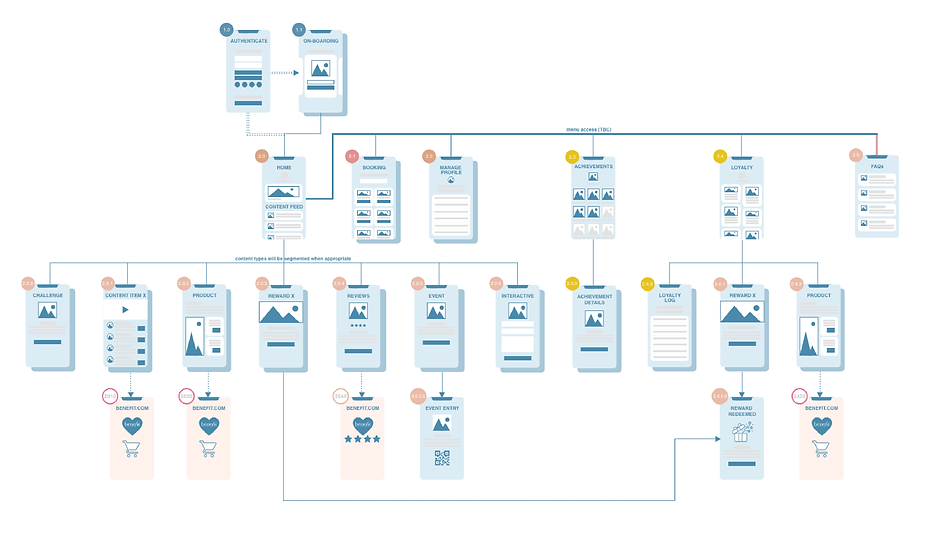
App information architecture was structured through running card sorting and tree testing exercises, user testing and simplifying (where possible) at each stage.
Design Sprints
Once the structure had been finalised, there was a series of cross project-team design sprints. Dependent on the section of the app, these would include client stakeholders, CRM teams, loyalty platform teams, development teams and my team.
The aims for these sprints were to agree a set of workable solutions that could be heatmapped and tested. Features that could not be delivered for v1.0 (but were desired) were put onto a development roadmap.

Wireframes
Post each sprint, the relevant app section was information and interaction designed, with extremely detailed annotated wireframes and simple user flow prototypes.
I still consider wireframing as a key tool, they are quick and effective, intentionally stripped back, they force focus on structure and information design, without the distractions of any UI design.
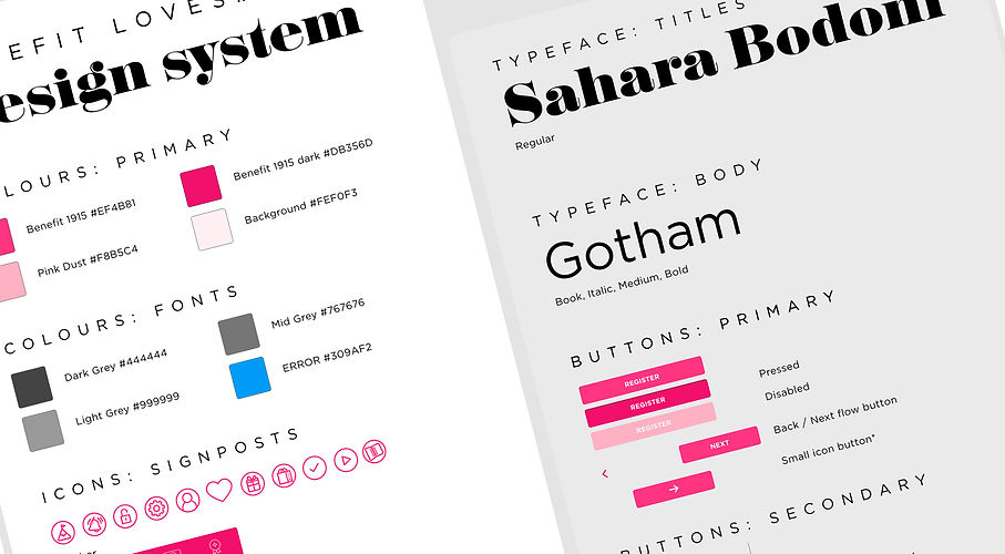
UI Design
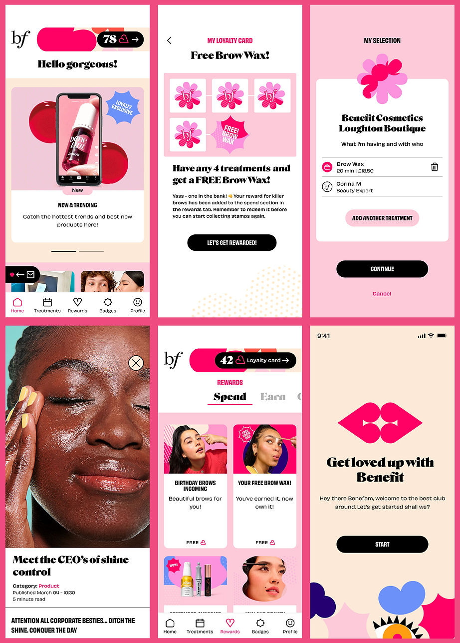
These example UI screens represent the approved UI design - but they are not the first 'approved' design. In fact they aren't even the second. The original UI was created just as the business started a global brand refresh. We had to adapt to a v1.5 (designed to a set of guidelines that didn't exist - 6 day turnaround, coffee on tap), then a full redesign once the refresh was finished.
UI updates were managed with the dev team in Trello and version controlled in Zeplin.
Roadmap and rollout
Although the project team adopted an MVP mindset, it would be fair to say the first release of the app was far more feature rich. Even so, we have rolled out a number of big feature / function enhancements since launch.
The global loyalty programme is currently in development, and the app will be rolled out to all ... watch this space!